The transformation of an interior is not about accumulating trends. It relies on precise technical decisions, coherent material choices, and a nuanced understanding of the existing space. We observe that the most successful projects always start from a constraint, never from a catalog of inspirations.
Air quality and interior decoration materials: an underestimated technical criterion
A choice of paint or wall covering is not limited to its color. The emissions of volatile organic compounds condition the air quality in each room, and this parameter directly influences the comfort experienced on a daily basis.
The 2026 trend guides converge on one point: prioritize materials rated A+ for VOC emissions. This classification, based on recommendations from ADEME, concerns paints, adhesives, varnishes, and floor coverings. An elegant interior that degrades the ambient air misses its target.
We recommend systematically checking the health labeling before any purchase of wall finishes or furniture made from particleboard. Mineral paints (lime, silicate) and clay-based coatings offer decorative performances comparable to synthetic ranges, with significantly lower emission levels.
In projects where the brand Mirage D’Intérieur provides decor advice, this health-materials approach is integrated from the selection phase, which avoids costly revisions after installation.

Color palette and emotional regulation in the living room
The choice of colors in a living space goes beyond aesthetic considerations. A study published in 2026 in Schizophrenia Bulletin confirms that cool palettes (soft blues, greens) increase the feeling of calm and reduce stress markers. Warmer tones, on the other hand, promote a willingness to engage in social interaction.
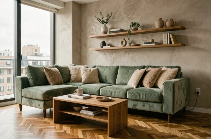
This distinction has concrete implications for the layout of a living room or common area. An accent wall in sage green behind a sofa produces a measurable physiological effect, not just a decorative one. Conversely, a golden ochre on the wall facing the dining table supports conviviality.
Applying this data to a real project
We advise against painting all the walls of a single room in one saturated color. The most effective strategy is to treat one or two load-bearing walls with the dominant color and leave the remaining surfaces in a complementary neutral tone.
The ceiling remains the great forgotten element. A pure white reflects natural light and compensates for the depth of a dark wall. A tinted ceiling (light gray, pale blue) visually lowers the ceiling height and creates a sense of enveloping, useful in large volumes.
Materials and textile layering: the technical grammar of style
An interior gains personality through the friction between materials, not through their uniformity. The principle of textile layering, which we apply to the majority of residential projects, is based on three complementary layers:
- The structural layer: the floor covering (solid wood, polished concrete, natural stone) and the main fabric of the sofa or seating. These elements set the visual temperature of the room.
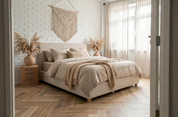
- The intermediate layer: curtains, rugs, throws. Their weight and texture create contrast with the structural layer. A washed linen on a polished concrete floor produces an immediate cold/warm balance.
- The accent layer: cushions, tablecloths, runners. These are the easiest elements to replace according to the seasons, and the most effective for injecting color without commitment.
Wood, omnipresent in contemporary interiors, should not be treated as a neutral material. Each species imposes its chromatic dominance: oak leans towards yellow, walnut towards reddish-brown, ash towards gray. Mixing two species in the same room works as long as they are not visually adjacent.
Lighting and volume: transforming space without altering partitions
Artificial light remains the most underutilized transformation lever. Most interiors suffer from a single ceiling light that flattens volumes and cancels out reliefs.
We structure lighting into three functional levels:
- Ambient lighting (floor lamps, dimmable pendants): it defines the overall atmosphere and should be able to drop below 2700 K for relaxation moments.
- Task lighting (reading lamps, desk lamps, adjustable spots): it targets a specific area without contaminating the rest of the room.
- Accent lighting (wall sconces, recessed LED strips, candles): it sculpts volumes, highlights a niche, a painting, or a wall texture.
Layering these three levels in each room eliminates the “waiting room” effect produced by a single light source. A dimmer on the main circuit costs little and radically changes the perception of volume.
The trap of inconsistent color temperatures
Mixing a cool white bulb (4000 K) with a warm white bulb (2700 K) in the same visual field creates discomfort that the brain registers without the occupant being able to identify it. We impose a homogeneous color temperature by living area, even if it varies from room to room.
A living room treated entirely in 2700 K with well-lit decorative objects by adjustable spots produces a more sophisticated result than an expensive furniture design illuminated by a fluorescent tube. Lighting defines style as much as furniture does.
Ultimately, the transformation of an interior comes down to a few structuring decisions: healthy materials, a color palette based on tangible data, controlled textile layering, and three-level lighting. This technical framework then leaves plenty of room for the personality of each space, without resorting to interchangeable decorative recipes.